flowchart LR
  A(匯入) --> B(複製)
  B --> C(貼上)
  C --> D{篩選}
  D --> E[樞紐分析]
  D --> F[合併彙算]
  E --> G[繪圖]
  F --> G[繪圖]
  G --> H(匯出)
http://rwepa.blogspot.com/2020/02/2019nCoV.html
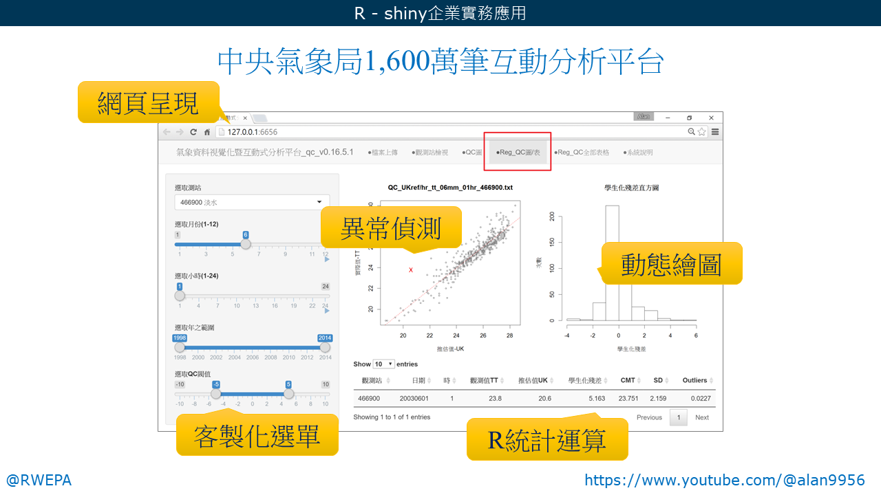
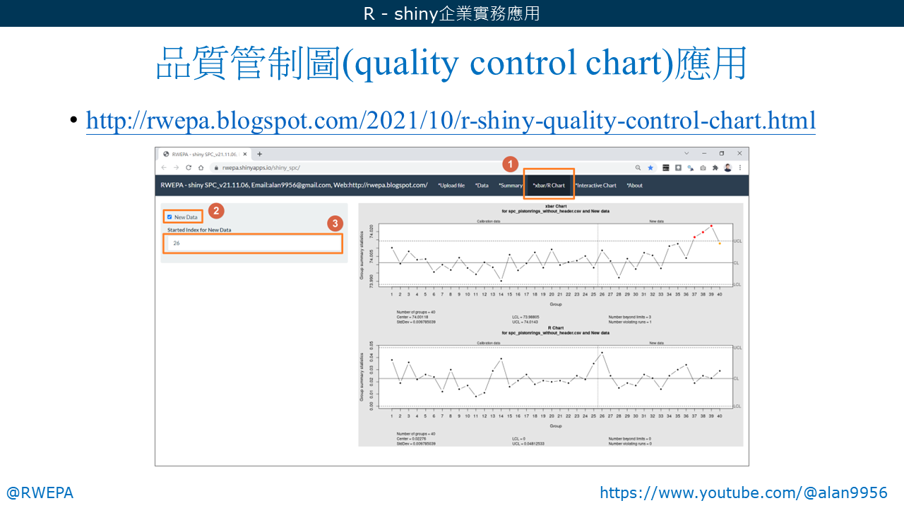
http://rwepa.blogspot.com/2021/10/r-shiny-quality-control-chart.html
http://rwepa.blogspot.com/2021/10/r-shiny-quality-control-chart.html
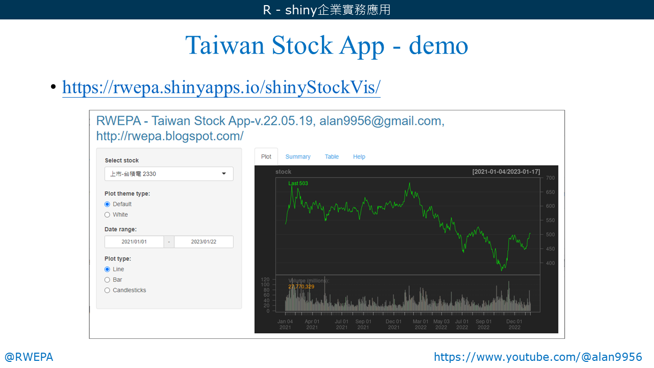
https://rwepa.shinyapps.io/shinyStockVis/